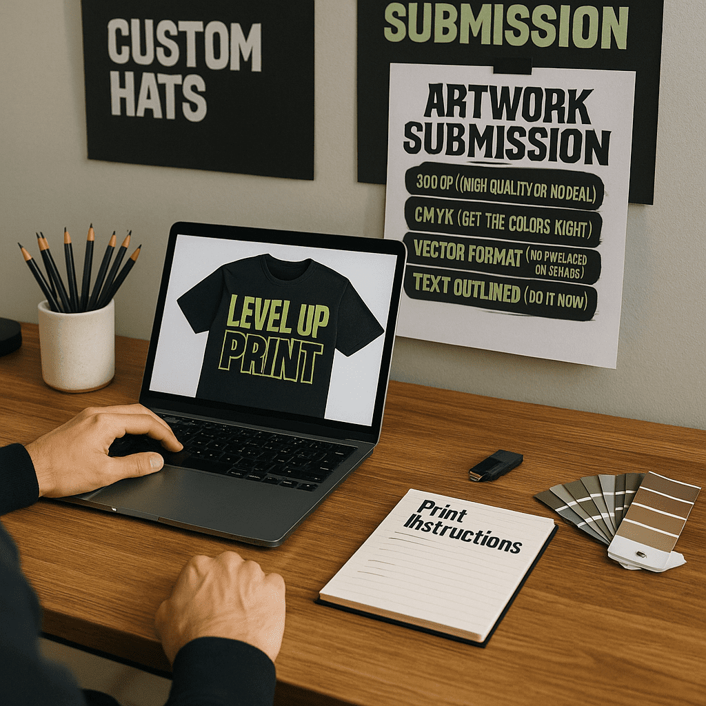
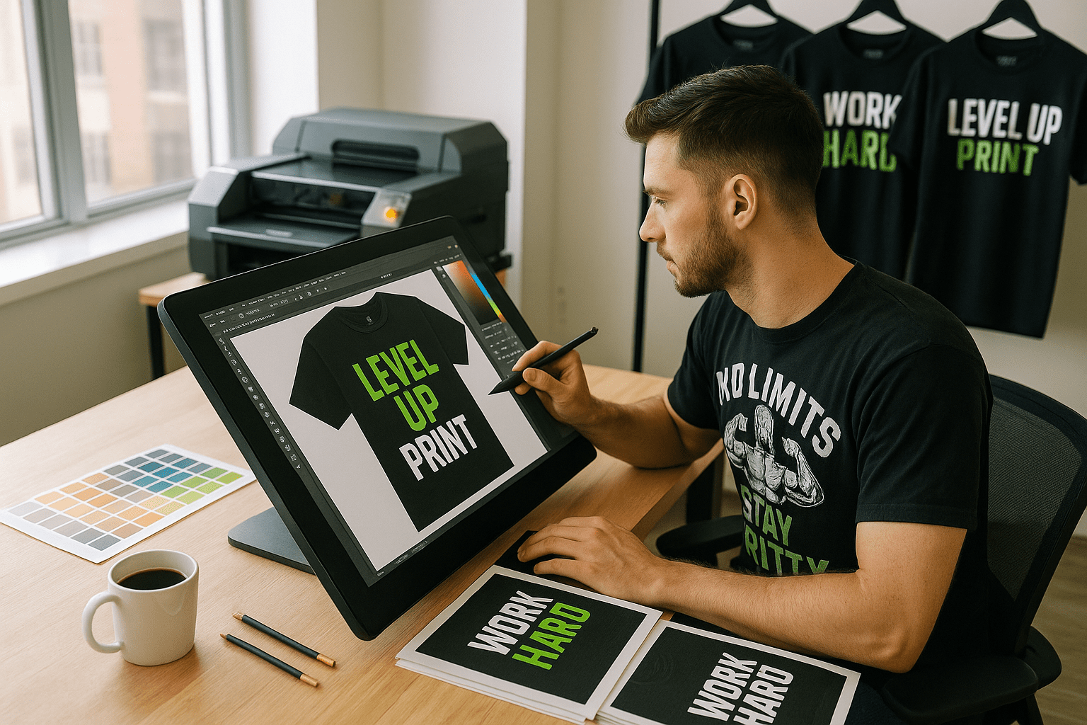
One of the most exciting parts of creating custom apparel is bringing your design to life. But before ink hits fabric or thread hits hoop, there’s one step that can make or break the whole thing: your artwork submission.
At Level Up Print, we’ve seen it all—logos pulled from Google Images, blurry screenshots, low-res phone pics, and file formats that send our print software into meltdown mode.
If you’re serious about getting clean, vibrant, professional results, here are the top mistakes to avoid when submitting artwork for print—and what to do instead.
🎨 Mistake #1: Sending Low-Resolution Images
The problem:
You email a JPG of your logo pulled from your website. It looks okay on screen, but when we blow it up for a shirt or banner… it gets pixelated and fuzzy.
Why it matters:
Print requires 300 DPI (dots per inch) resolution. Web images are often only 72 DPI, which just doesn’t cut it for high-quality output.
✅ Fix:
Submit artwork that is:
- 300 DPI or higher
- Sized correctly for the intended print area
- Ideally in vector format (more on that next)
🖼 Mistake #2: Not Using Vector Files (When Possible)
The problem:
Raster files (like JPGs or PNGs) can lose quality when resized. Vector files (like AI, EPS, or SVG) can scale infinitely—perfect for screen printing and embroidery.
Why it matters:
Vector files give us clean lines, editable colors, and precise scaling, which are essential for color separation, digitizing, and print clarity.
✅ Fix:
Submit vector artwork created in Adobe Illustrator or similar programs. If you only have a raster version, ask your designer to convert it—or we can help clean it up for you.
💥 Mistake #3: Using Too Many Small Details or Thin Lines
The problem:
Your design looks great on your laptop—but all those intricate lines, gradients, and micro-text? They get lost in translation on a shirt, hat, or banner.
Why it matters:
Certain methods (like embroidery or screen printing) can’t capture ultra-fine detail. Lines under 1pt or text smaller than 10pt may not reproduce well.
✅ Fix:
Keep your artwork bold, clean, and high-contrast. Use larger text and avoid super thin outlines or super subtle shading—especially for hats and dark garments.
🎨 Mistake #4: Submitting the Wrong Color Mode (RGB vs. CMYK vs. Spot)
The problem:
You design in RGB (what screens use), but printers operate in CMYK or Pantone spot colors. The result? Unexpected color shifts.
Why it matters:
RGB colors often appear more vivid on screen than what’s possible in print. If not adjusted, your neon green might end up dull olive.
✅ Fix:
- For DTF or digital print, submit files in CMYK color mode.
- For screen printing, specify Pantone (PMS) colors for accurate ink matching.
- We’ll help with conversion and proofs—but knowing this upfront helps prevent surprises.
📁 Mistake #5: Sending Flattened or Merged Files
The problem:
You send a Photoshop file with all layers merged. Now we can’t isolate elements, change colors, or adjust placement without redoing the entire file.
Why it matters:
Editable layers give us more flexibility to prep the file for production, especially if changes or adjustments are needed.
✅ Fix:
Send files with:
- Editable text (not rasterized)
- Unmerged layers (PSD or AI files)
- Linked assets embedded or included in a zip folder
🔄 Mistake #6: Forgetting to Convert Text to Outlines
The problem:
You designed your shirt with a fancy font—but when we open the file, our computer substitutes it with something completely different.
Why it matters:
If we don’t have the exact font file, your layout could shift and ruin the design.
✅ Fix:
Convert all text to outlines or paths before submitting. That way, your font style stays locked in—even if we don’t have the font installed.
🎯 Mistake #7: No Clear Instructions
The problem:
You send a file with no note on where to place it, what size to print it, or what garment it’s going on.
Why it matters:
Without direction, we’re guessing on placement, scaling, and orientation—and that’s not how you get great results.
✅ Fix:
Include a short message or visual mockup with:
- Garment type/color
- Print location (front, back, sleeve, chest, etc.)
- Size in inches
- Any special notes (e.g. “centered 3” below collar”)
🧠 Bonus Tip: Ask for a Proof (We Got You!)
Even with perfect files, it’s always smart to request a digital mockup or print proof before production. At Level Up Print, we automatically provide proofs to catch issues and make sure your vision matches the outcome.
✅ Quick Artwork Submission Checklist
Before you send in your artwork, ask yourself:
- Is it 300 DPI (or in vector format)?
- Are colors in CMYK or Pantone mode?
- Is the text outlined and layers unmerged?
- Are all files packaged together and properly labeled?
- Have I included print size, placement, and garment info?
If yes—you’re ready to go!
💬 Final Thoughts
Submitting the right artwork doesn’t have to be complicated. A few simple tweaks and guidelines can save time, reduce back-and-forth emails, and guarantee your final product turns out just the way you imagined it.
Whether you’re a seasoned designer or a small business owner working with a Canva file, we’re here to help. Need help fixing a logo or prepping a file? No worries—Level Up Print has your back just contact us!
Ready to print? Send your file our way—we’ll make it look awesome.